Max Bi
Animated by a “citationist nomadism”, inherited from the knowledge one of the masters of the Transavanguardia, Sandro Chia, between the end of the ‘90s and the beginning of the 2000s, he begins to experiment with the mixture of languages and expressive techniques, extrapolated from the most disparate artistic currents that have crossed the second half of the twentieth century, of which he is a refined connoisseur, to reach the creation of his own personal stylistic code.
In the early 2000s, the artist recreates, using a wide variety of techniques and different materials with ease, (from the impression on emulsified canvas to the assemblage of panels of industrial cargo and faesite) the calligraphic graphisms of the writers, their tags, similar to primordial graphemes, using the stencil and the spray can on raw jute canvas, or through enamels and acrylics alternating with material thickening of sand, quartzite and aluminum powder, drawing its figurative ideas from the iconographic landscape of Italian Pop Art, from the tribal masks of Paladino or Basquiat graffiti, but reinterpreted in an informal key with drafts of charcoal and iron fillings; in the first decades of the 2000s, everything is incorporated in a dense agglomerate of black and white brushstrokes applied with vehemence, reminiscent of the informal painting of Vedova, as well as the thickening of scratches and abrasions of the walls of the cities, to which the artist is able to give a strongly material connotation, reinterpreting it with the technique developed between 2003 and 2008, of tearing the jute from the preparation of plaster dust, marble and cement spread on the wall, on which he paints “a fresco”.
All this without abandoning his inexhaustible way of reinventing himself in new artistic practices, reaffirmed also by the self-affirmation that seems to evoke the pronunciation of his art name: “Max Bi: to be Max, that is, to be myself, therefore to express myself”, in a constant material and linguistic metamorphosis. In 2006, in fact, for the personal exhibition Umanità e post-Umanità, realized in the context of the splendid medieval architecture of the Civic Tower of Solferino (Mn), on the occasion of the 150th anniversary of the foundation of the Red Cross, the artist presented not only a fresco in jute with the well-known symbol of this institution, covered with writings, but also a decomposition, minimal and conceptual the the same time, in luminous cubes of the letters of the word “humanity”, the first of the seven constituent principles adopted at the XX International Conference of the Red Cross in Vienna in 1965, as well as the dissemination of the figure of Henry Dunant, the founder, in his frescoes on jute, mindful of some works by Giulio Paolini. Every year, on the occasion of the World Red Cross Day, a large jute fresco depicting Henry Dunant is displayed on the facade of the Civic Tower of Solferino as a banner. The artist has also donated to the Red Cross Museum of Castiglione delle Stiviere (Mn) the fresco one jute called Cool Bibi, depicting a little girl exposed to radiation, still on permanent display.
In the period between 2006 and 2008, the works made with the technique of fresco on jute have been exhibited at national level, such as the International Prize Ingenuous Art 2008, at the Castle of Brescia, as well as in Crema and Milan, and international, such as the exhibition Italian News at The Chiar Gallery in SoHo, New York, where he exhibited some portraits in pop style, including that of Pasolini. His frescoes on jute have earned him numerous awards: in 2006, he was among the winners of the Homo Urbans award, organized by the Faculty of Architecture of Palermo, as well as a finalist in the Sabaudia Prize, the Celeste San Gimignano (Si) and the Silent Art Movies competition of Aosta, for the creation of a poster for the silent film festival, with the work La diva del muto, the Regional Biennal Painting Competition “Emilio Rizzi”, sponsored by the Area Association of Brescia and the Painting Prize “Carlo Dalla Zorza”. In particular, the works focused on the race of the racing cars participating in the Mille Miglia have been exhibited on the occasion of the collective dedicated to the historic car race, organized by the gallery Colossi Arte Contemporanea of Brescia: Automobile-Automobile, in 2008, and in 2010, and Mille Miglia… d’Arte, held at the Sala dell’Affresco of the Museo Santa Giulia in Brescia, in 2009; in the same year, the artist exhibited a concrete, on which was impressed the imprint of the first man to walk on the moon, Nail Armstrong, on the occasion of the exhibition held in the exhibition spaces of the same gallery to celebrate the fortieth anniversary of the moon landing with the exhibition LUNA e l’altra. The art side of the moon. In 2010, two Marilyns, made with the technique of fresco on jute sack, are exhibited on the occasion of the exhibition Marilyn Monroe. Arte della bellezza, curated by Carlo Occhipinti, at Villa Ponti, in Arona (No) and, in 2011, of the two-person Pop stars, with Olindo Bottura, at the the Hall of Saints Philip and James in Brescia, accompanied by other portraits of jute icons of the star-system. On this occasion, following his indefatigable impulse to experimentation, he presents an almost cinematographic audio-video installation, Popper, that shows us how the reign of these myths is ephemeral, destined to a rapid disappearance, consumed by time, corroded like the images of his urban suburbs on the unevenness of jute: a pressing succession of images taken from the world of television, mounted as a sequence of frames, is made more and more psychedelic by the accompaniment of music with a rhythm even more accelerated than the heartbeats.
If the practice of tearing is reminiscent of Rotella’s décolletage, that of the fresco takes us back to the beginnings of humanity, as if the artist wanted to “impoverish the signs” in order to return to archetypal forms of culture, as Germano Celant maintains when speaking of Arte Povera.
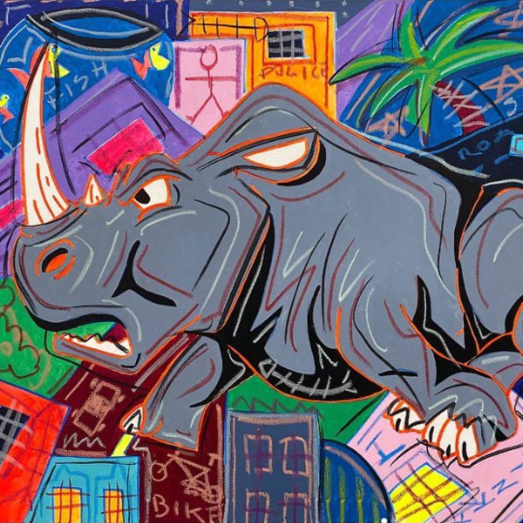
Also in Max Bi’s latest works, we find a dense panorama of archetypal symbols taken from underground culture that go define an “undergorund” urban landscape, rich in iconographic allusions to 80s graffiti and street art: in this urban background, stand out animals defined in a cartoonish way by garish and acid colors, frayed and nervous graphic traits that, always, replacing the interweaving of market black lines on the frescoes on jute and on canvas, in a relentless anxiety of experimentation of new artistic languages, characterize his modus operandi and his irreverent character, aimed at corroding habits and semantic conformisms.
The undulating trend, which closes and uncloses the forms, of the black lines on the latest canvases represents the stylization of the agglomerate of marked black signs that, since the beginning, have characterized his works, mindful of abstract expressionism, to get to the frescoes on jute of the 2000s depicting intertwined tracks and pylons of high voltage.
Through the cathartic ritual of the process of hot bending of iron bars, with the same voluptuousness with which he worked terracotta, Max Bi flexes this material of technological modernity into virtuosic contortions in space: they are defined by the black strokes on the canvas.
Works
-
 Bull.ismo
MIXED TECHNIQUE ON CANVAS
-
 PINK LADY
MIXED TECHNIQUE ON CANVAS
-
 Oo7
Oo7MIXED TECHNIQUE ON CANVAS
-
 Zero zero seven
MIXED TECHNIQUE ON CANVAS
-
 Diabolik e Eva Kant
MIXED TECHNIQUE ON CANVAS
-

-

-
 Viktoria
MIXED TECHNIQUE ON CANVAS